


Understand the application
Agree who receives the material, what it should explain and how it will be printed or used.
Business cards, proposals, brochures and packaging should look like they belong to the same business. We design the layouts and prepare the artwork for their intended format and production.
Discuss your project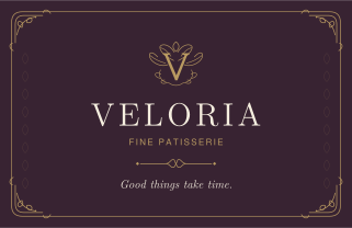
VELORIA pairs a botanical V monogram with classical typography and an ornamental frame. Deep plum, warm ivory and antique gold give the identity a rich, composed character. The dark front introduces the brand; the lighter reverse keeps contact details clear. The proposed finish combines textured 400 gsm stock with satin-gold detailing.
THE DIRECTION VELORIA is an original identity concept for a fine patisserie. The design balances decorative detail with a clear hierarchy: the name and monogram lead, while the frame, typography and smaller ornaments support them. COLOUR Deep plum (#382332) gives the front a distinctive background and sets off the ivory lettering. Warm ivory (#F5EEDF) creates a lighter reverse with readable plum text. Antique gold (#B99A61) is reserved for the monogram, border and dividing lines, linking the two sides through a consistent accent. IDENTITY AND TYPOGRAPHY The botanical V monogram brings the initial and a floral motif into one mark. Serif lettering gives the name its character; italic messages add a softer voice. Sans-serif descriptions and contact details provide a practical contrast. The ornamental frame adds richness while leaving the central composition open. LAYOUT The front follows a central axis, moving from the monogram to the name, descriptor and closing line. The reverse uses two columns: the message and contact details on the left, the seal and specialties on the right. A fine gold rule separates their functions. MATERIAL AND FINISH The proposed specification is an 85 x 55 mm card on textured 400 gsm ivory stock, with matte surfaces and restrained satin-gold foil details. Material and foil remain design proposals. Project status: original brand concept.
Illustrative design · Q-BRIQ · Original brand concept
Explore the visual directions, then we design a card around your own identity, details and print requirements.
Layouts and production-ready artwork for the agreed digital and printed materials.
The final scope, formats and review stages are agreed with you before work begins.
Give someone a clear, well-made reminder of the business. We balance the identity, contact details, format and finish.
Explore the details 02 / Design & printOrganise the offer into pages people can browse, understand and keep.
Explore the details 03 / Design & printExtend the identity into campaigns, proposals, packaging and everyday communications.
Explore the detailsAgree who receives the material, what it should explain and how it will be printed or used.
Connect the content, hierarchy and visual identity. Review representative pages, formats and production choices.
Check the agreed output against the supplier or digital specifications and explain any separate production costs.
Need these services to keep working together?
Explore monthly partnership